Handling iOS Safari toolbar for full height web content
Using the dvh unit for content that adapts to the viewport height
Available for consultation.
Senior Frontend Engineer with a Master’s degree in Computer Science – my expertise lies in frontend technologies and driving the direction of frontend engineering to align with business needs.
Initially working with Angular, most of my recent projects involve using Next.js or React, which I’ve now been using for 5+ years. Regardless, my experience is that a strong fundamental understanding of HTML, CSS and JavaScript is what helps us deliver truly next-level user experiences, with frameworks being a declarative way to do so.
Attention to detail is a key aspect for me, in delivering both exquisite and performant frontends. Being conscious about micro-interactions, infrastructure decisions (like CDNs), accessibility, web vitals, SEO and UI/UX best practices are all important factors for me and part of an ever-learning process.
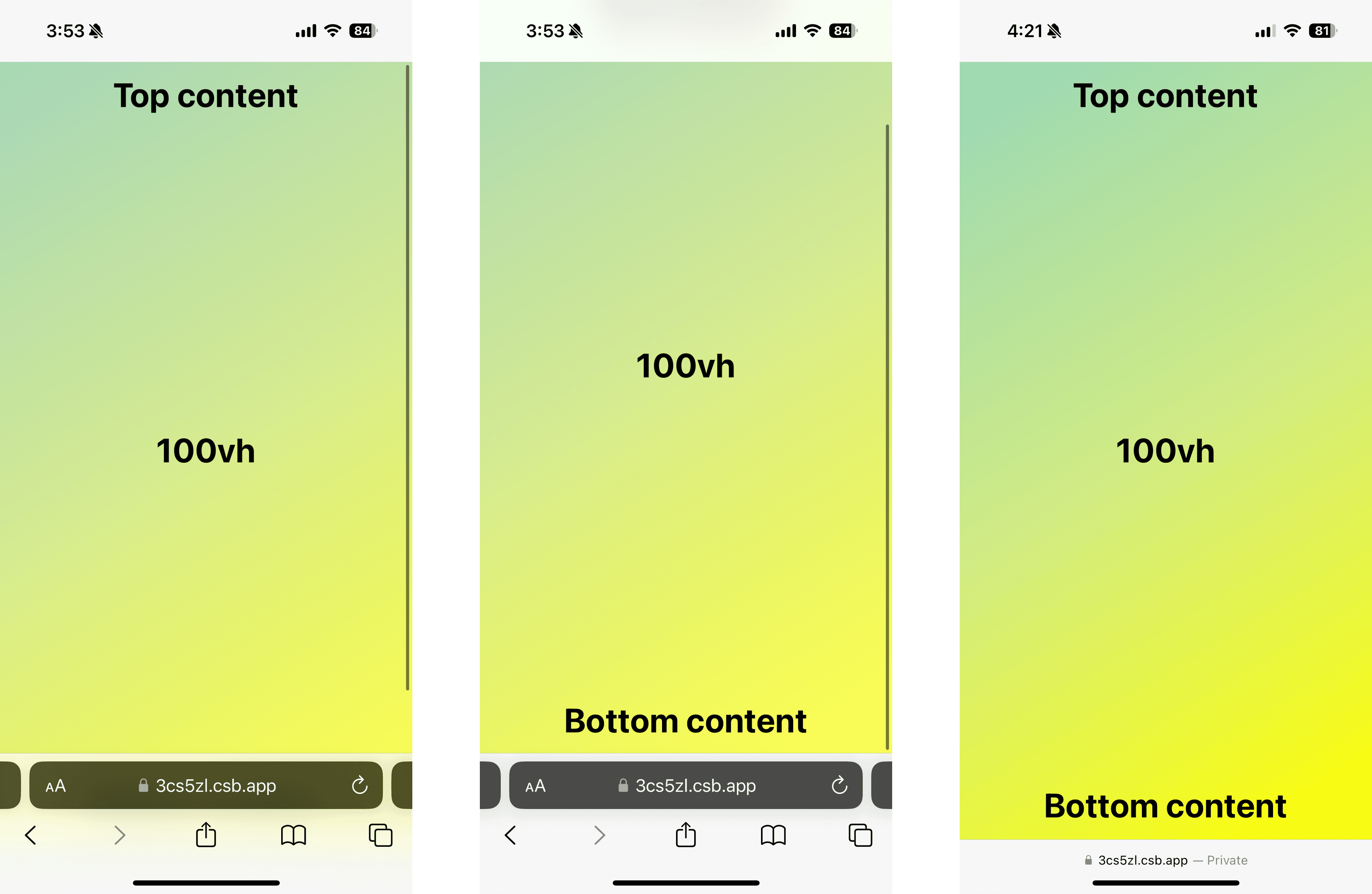
I recently ran into an issue where I had some content to display that spans the full height of the device and the code was using height: 100vh to achieve the same. When testing on iOS Safari, you'll see there's an issue with this:

As seen in the above screenshots from Safari on an iPhone, using 100vh introduces a scrollbar when the Safari toolbar is visible and cuts off the bottom content.
This is because the vh unit computes the viewport size without factoring in the toolbar height. Thus, the user either needs to scroll down for the address bar to automatically disappear or manually hide it for all content to be displayed.
Unfortunately, there's no way to programmatically hide the toolbar on iOS Safari using JavaScript at the time of writing. However, there is a solution for the content to adapt with the toolbar using the dvh unit.
The dvh unit stands for dynamic viewport height and enjoys support from all the latest browsers. This unit factors in the viewport that's truly visible to users.
In case, you want to work with earlier versions of browsers that don't support dvh, you can make use of the @supports CSS rule.
Here's an example of how you'd set up a class called full-viewport-height that adapts according to the browser viewport using the dvh unit but falls back to vh if the browser doesn't support it:
.full-viewport-height {
  height: 100vh;
}

@supports (height: 100dvh) {
  .full-viewport-height {
    height: 100dvh;
  }
}
Using this full-viewport-height on our container now, the result looks as expected:

The content using 100dvh now spans the whole height of the web page even if the Safari toolbar is visible and on scrolling down or hiding it, the content adapts to fill the whole page making sure your content always covers the viewport as expected.
You can find the code sandbox for the above examples at vh-sandbox and dvh-sandbox.