Animating a list in React with Framer Motion
Learn list item stagger animation in React by re-creating the iOS Control Centre Focus Modes animation using Framer Motion

Available for consultation.
Senior Frontend Engineer with a Master’s degree in Computer Science – my expertise lies in frontend technologies and driving the direction of frontend engineering to align with business needs.
Initially working with Angular, most of my recent projects involve using Next.js or React, which I’ve now been using for 5+ years. Regardless, my experience is that a strong fundamental understanding of HTML, CSS and JavaScript is what helps us deliver truly next-level user experiences, with frameworks being a declarative way to do so.
Attention to detail is a key aspect for me, in delivering both exquisite and performant frontends. Being conscious about micro-interactions, infrastructure decisions (like CDNs), accessibility, web vitals, SEO and UI/UX best practices are all important factors for me and part of an ever-learning process.
Introduction
Apple iOS is full of nifty animations and a great source of inspiration when thinking about motion in your next web app. Many of these take users from one view to another in a seamless transition instead of a jarring switch.
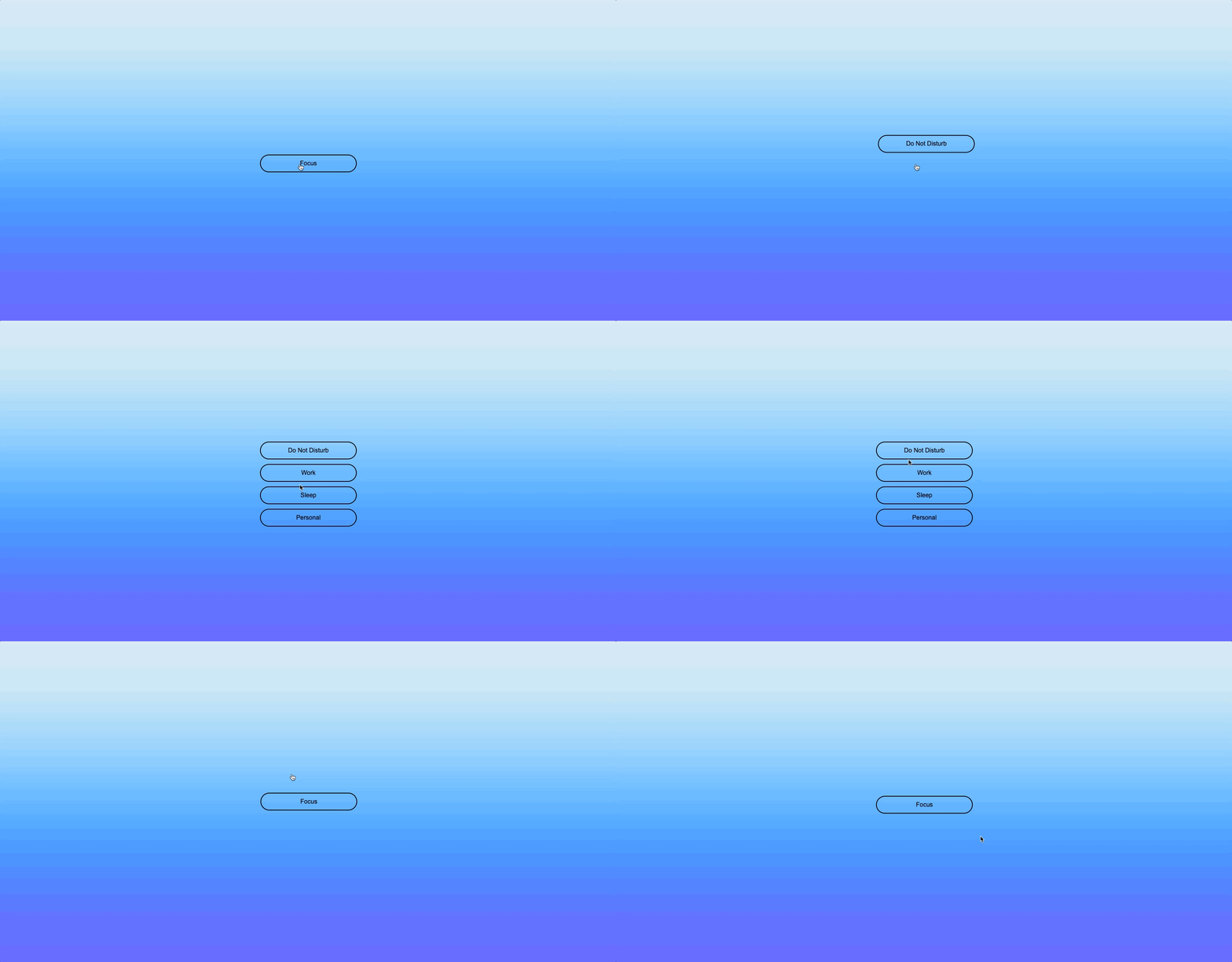
One such example is on clicking the Focus mode selection button in the Control Centre:
In this article, we'll re-build this animation in React with Framer Motion.
In case, you're not familiar with Framer Motion, I recommend checking out the article:
which goes over some basics of Framer Motion by creating a reusable animated check icon component.
Demo
Checkout the code and demo of the final animation we'll build as part of this article:
Layout Animation
After playing around with the demo above, did you notice how clicking on the Focus button takes you to the list of focus mode options in a smooth transition? This is a result of the Focus button "moving into" the list of options and becoming the Do Not Disturb button.
Wait, doesn't that require a lot of complex logic to make sure the animation happens performantly? It's the reason the FLIP technique exists, but we want to keep our code declarative. That's where the layout prop provided by Framer Motion comes into play.
You start by adding the layout prop to a motion component, in this case, the motion button:
<motion.button layout>Focus</motion.button>
Now, anytime a style change happens that affects this button's layout, Framer Motion will transition between the layout changes automatically in a performant way. Try clicking the Toggle layout button in the demo sandbox below and see it smoothly transition between two different locations. Then, try removing the layout prop from the button and see the difference!
By default, the layout prop animates any changes to the size and position of the motion component it's used on. This can, at times, lead to undesirable animations where the content can be squished or stretched when transitioning between layouts, especially when the size changes between the start and end state.
To circumvent this, the layout prop also accepts one of the following values:
layout="size"only animates the size changes in the motion component, for instance, the width and height.layout="position"only animates changes in the position of the motion component, as in our example.layout="preserve-aspect"only animates the size & position if the aspect ratio remains the same between the transition, and just position if the ratio changes.
In our use case, where we only want the position of the Focus button to transition to the Do Not Disturb button, we'll make use of the layout="position" prop.
Now that we know we only want the layout position to change and how it works, how do we create the transition between the two buttons? After all, we don't have a pre-calculated value to know where the Do Not Disturb button should render on the DOM. We want to be able to render the focus modes list component anywhere in the app while having the animation work as desired.
Well, Framer Motion provides yet another prop called layoutId to create shared layout animations.
View the sandbox below to see how two different motion buttons are rendered separately in the DOM with their styling, but by providing the same layoutId to both of them, Framer Motion can transition between the two as they are removed or rendered in the DOM:
Variants & Stagger Animation
As we saw in the article about creating an animated check icon, we can provide an initial and animate prop to a motion component to specify the states it should start with and end at, and Framer Motion automatically animates the transition between the states. In that article, we passed an object to these props specifying the styles for the two states but the initial and animate can also accept a string which should correspond to the name of a Framer Motion Variant.
A variant is an object with the variant name for the key and the animation properties for the values. They also prove to be a nice way to be more descriptive about animation states in Framer Motion.
For instance, here's the variant object defined for the focus modes list items:
{
  hidden: {
    y: -10,
    opacity: 0
  },
  visible: {
    y: 0,
    opacity: 1
  }
}
If we break this down, we see that:
When the variant name is
hidden, the element's opacity is 0 and it sits 10 pixels above its normal positionHowever, when the variant name is
visible, the element's opacity is 1 and it sits at its normal position
We can take this variant object and provide it to a motion li component which we will render for each focus mode:
<motion.li
  variants={{
    hidden: {
      y: -10,
      opacity: 0
    },
    visible: {
      y: 0,
      opacity: 1
    }
  }}
>
  Do Not Disturb
</motion.li>
Alright, now that we've specified what styles we want for our list items corresponding to variant names hidden and visible, we need a way to determine when a variant gets applied.
Now's a good time to mention that variants propagate from parent components to their children. This means if we set these variant names to the parent ul to be applied for the initial and animate props, these would automatically flow down to the child li. So, as soon as the ul mounts, it's initially using the hidden variant and animates to the visible variant, which is the same behaviour its children li follow:
<motion.ul
  initial="hidden"
  animate="visible"
>
  <li variants={variantsFromTheSnippetAbove}>Do Not Disturb</li>
</motion.ul>
Not only are variants helpful to keep our animation states more readable and have the values propagate to children, but they also have another trick up their sleeves. Variants are helpful to orchestrate animations! This means we can set additional animation configurations on the parent element's variants prop to define the animation execution of its child motion components. This will become clearer by explaining the snippet below:
<motion.ul
  initial="hidden"
  animate="visible"
  variants={{
    visible: {
      transition: {
        delayChildren: 0.2,
        staggerChildren: 0.05
      }
    }
  }}
>
  <li variants={variantsFromTheSnippetAbove}>Do Not Disturb</li>
</motion.ul>
We've added a new variants prop to the ul which defines a transition behaviour for the visible variant. It says that whenever the visible variant is applied, please delay the animation of the children by 0.2 seconds and stagger them with a delay of 0.05 seconds, so they render one by one, as it does on iOS.
Play around with the code sandbox below to view how variants help us create the stagger animation we want for our focus modes list:
Putting It All Together
It's time to put the layout animation along with the variant stagger animation we've learnt to re-create the iOS animation.
We'll create the Focus button with the layout="position" prop and give it a layoutId of focusModeButton. This button's onClick event handler will update the state to display the focus modes list we'll create next.
<motion.button
  layout="position"
  layoutId="focusModeButton"
  onClick={() => setIsFocusModesListVisible(true)}
>
  Focus
</motion.button>
To create the focus modes list, we'll use the ul and li elements along with Framer Motion's variants prop as we saw in the last section.
We can define the variants for the list container and the list items in separate constant objects as follows:
const LIST_CONTAINER_VARIANTS = {
  visible: {
    transition: {
      delayChildren: 0.2,
      staggerChildren: 0.05
    }
  }
};

const LIST_ITEM_VARIANTS = {
  hidden: {
    y: -10,
    opacity: 0
  },
  visible: {
    y: 0,
    opacity: 1
  }
};
These are the same animation configurations we saw earlier to re-create the focus modes list stagger animation. Finally, we'll apply these variants to the ul and li elements, while providing the first Do Not Disturb button, the same layout animation behaviour as we did for the Focus button, i.e., layout="position" and the same layoutId of focusModeButton:
<motion.ul
  variants={LIST_CONTAINER_VARIANTS}
  initial="hidden"
  animate="visible"
>
  <motion.li>
    <motion.button
      layout="position"
      layoutId="focusModeButton"
    >
      Do Not Disturb
    </motion.button>
  </motion.li>

  <motion.li variants={LIST_ITEM_VARIANTS}>
    <motion.button>Work</motion.button>
  </motion.li>

  <motion.li variants={LIST_ITEM_VARIANTS}>
    <motion.button>Sleep</motion.button>
  </motion.li>

  <motion.li variants={LIST_ITEM_VARIANTS}>
    <motion.button>Personal</motion.button>
  </motion.li>
</motion.ul>
Using these two components, we can use React's state to toggle between the Focus mode button and the focus modes list, while Framer Motion handles the animation between the two:
{isFocusModesListVisible ? (
  <FocusModesList onClose={() => setIsFocusModesListVisible(false)} />
) : (
  <motion.button
    layout="position"
    layoutId="focusModeButton"
    className="FocusModeOpenButton"
    onClick={() => setIsFocusModesListVisible(true)}
  >
    Focus
  </motion.button>
)}
With this, we end up with the final animation as we set out to build:
Thanks for reading and stay tuned for more articles on the topic!


